Eken
Client
Eken
Project Date
January 2025 • Passion project
Category


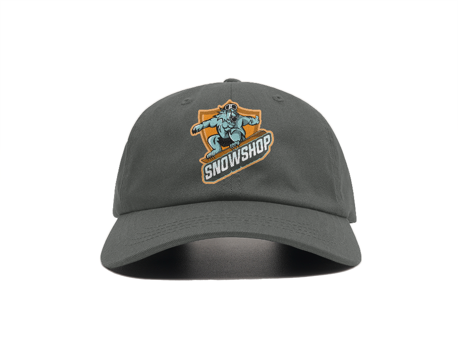
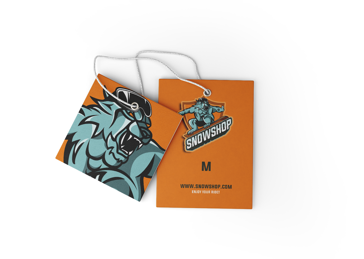
Eken
January 2025 • Passion project


Once the visual identity was established, it was time to design appropriate tools: websites, project presentations and templates for social networks.
My priority here was to make Facili’s communication work as easy as possible by providing tools that are quick to use, so that the company can focus on its content, and not on design anymore!

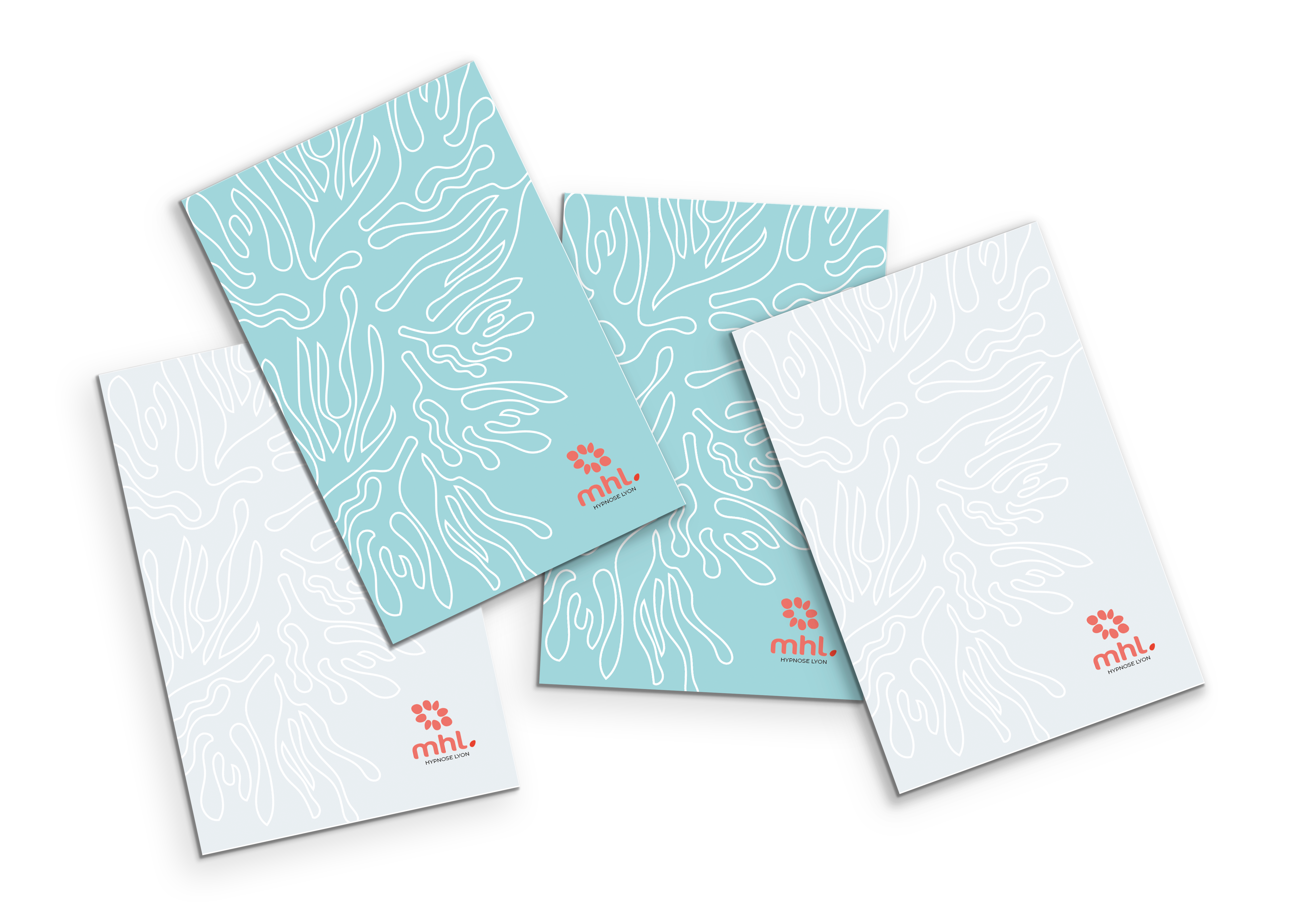
Creation of a logotype and a complete visual identity (color palette, typography choices, patterns, backgrounds and graphic elements, business cards, and letterhead) for a professional practice specializing in hypnotherapy.
The logo icon is inspired by an aquatic flower, the water vanilla, which has the unique characteristic of blooming in winter.


Layout of a children’s tale – Sleeping Beauty by Charles Perrault – in a square format (18 cm), with a hard-sealed binding. This project is inspired by the gouaches of the American artist Alexander Calder who is used to drawing simple shapes, inspired by plants, with bold colors such as those chosen here. The idea is to present patterns with accentuated contours, with flat areas of color on the edge, to give the impression of a coloring book.
ExLibris Publishing Company
Student project, April 2021