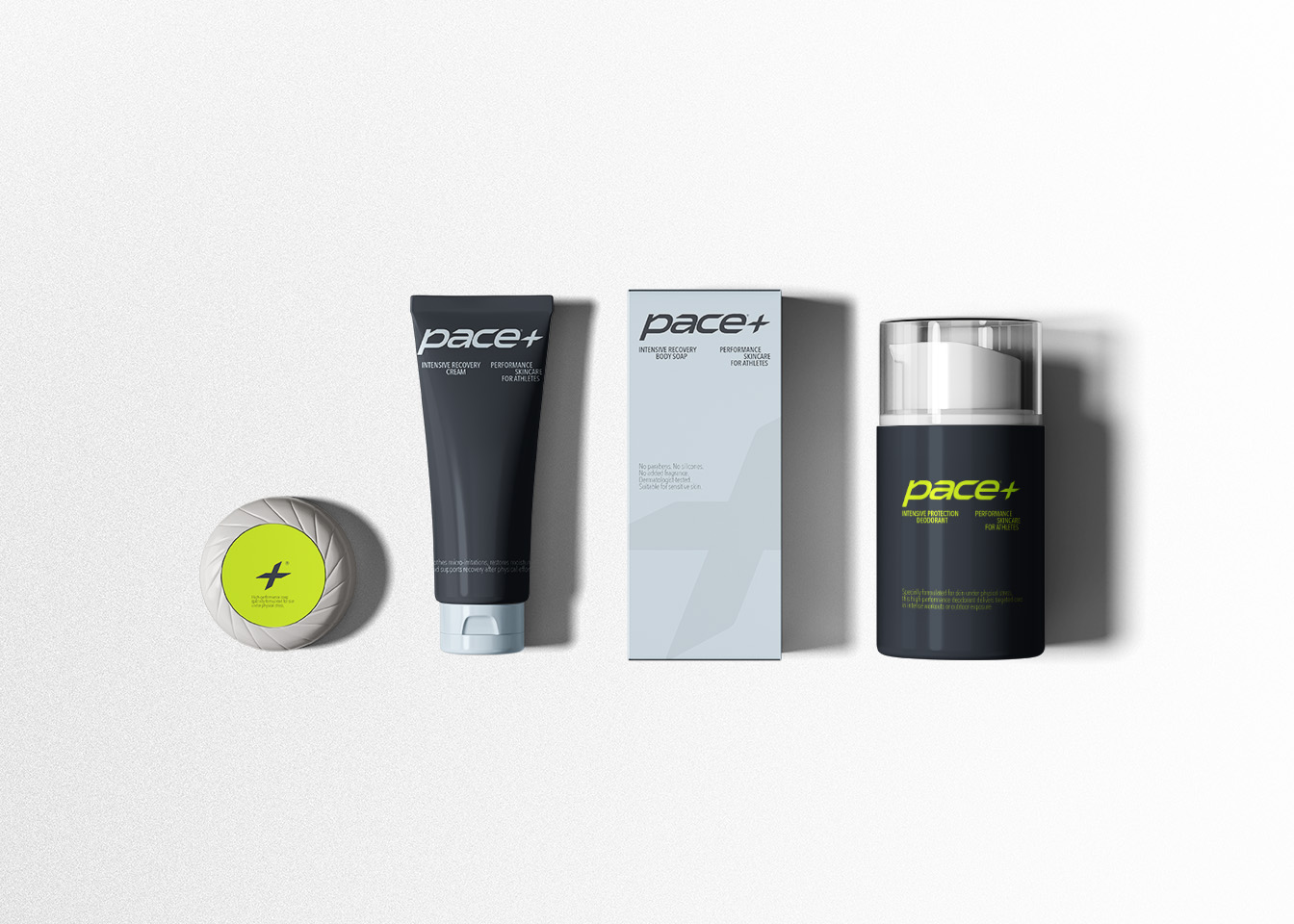
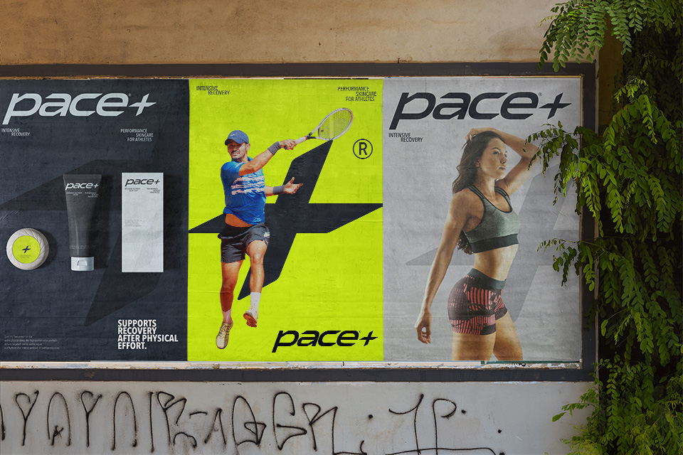
Pace is a body care range designed for athletes and sports enthusiasts, from high-level performers to amateurs. The formulations are specifically developed to meet the needs of the body before and after effort, with a particular focus on hydration and recovery.

The visual identity draws its primary inspiration from water — the immediate sensation sought after exertion: freshness, relief, and rehydration. A soft, aqueous tone establishes a sense of calm and soothing, balanced by a deeper petroleum blue that adds contrast and depth. To preserve the energy inherent to the world of sport, a vibrant lemon yellow punctuates the palette, introducing a refreshing and invigorating accent.
The logotype is built on a structured, forward-looking typography. Its clean and minimal construction conveys both precision and reliability, while subtly referencing performance and innovation.
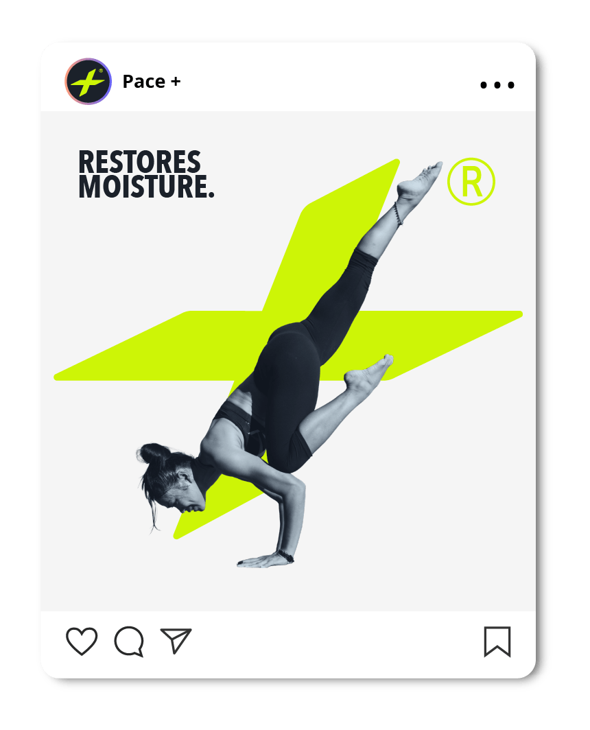
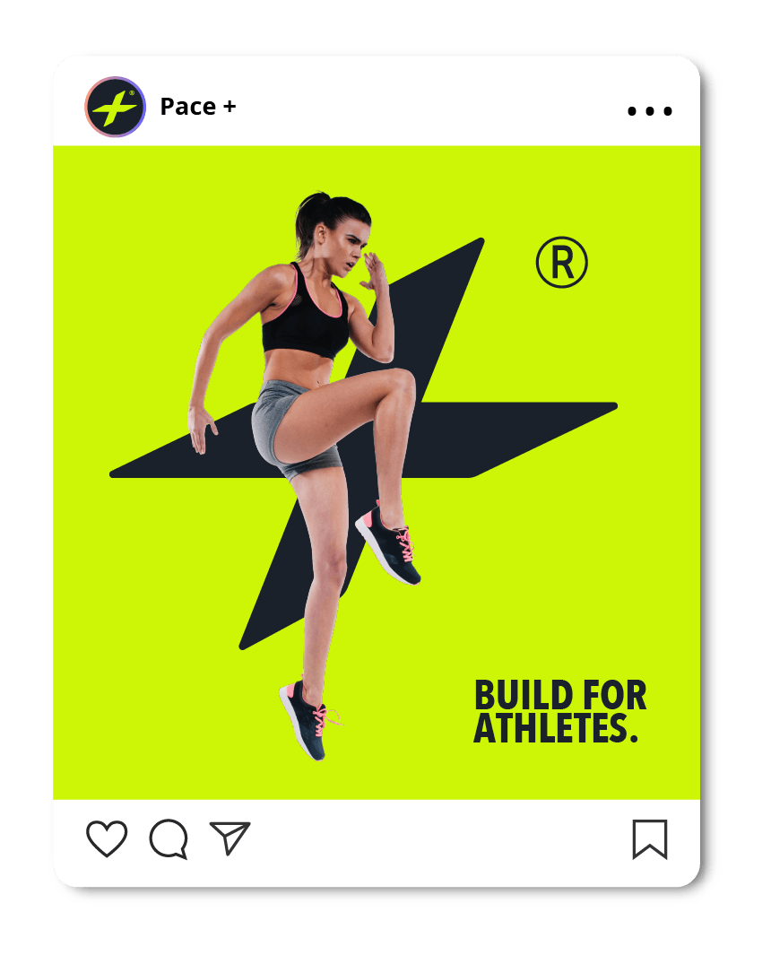
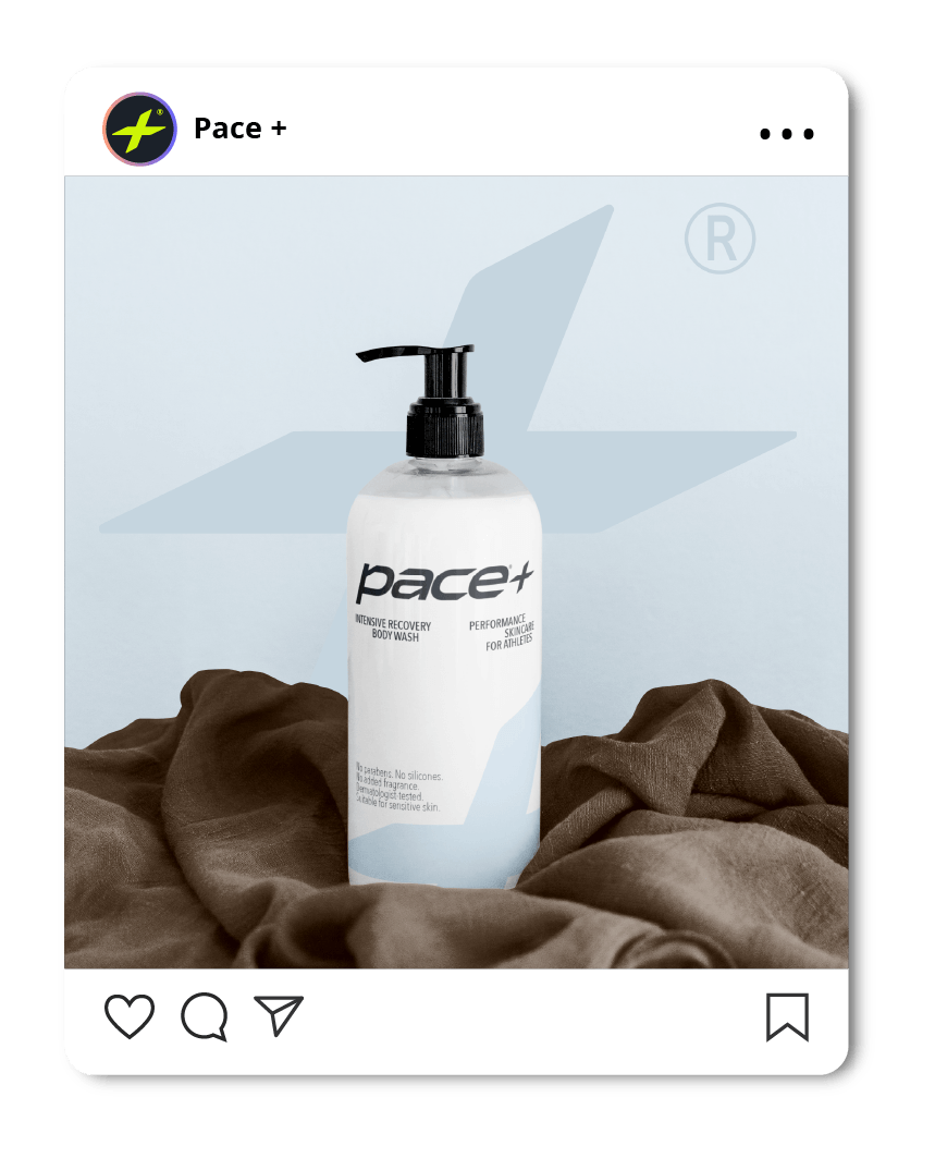
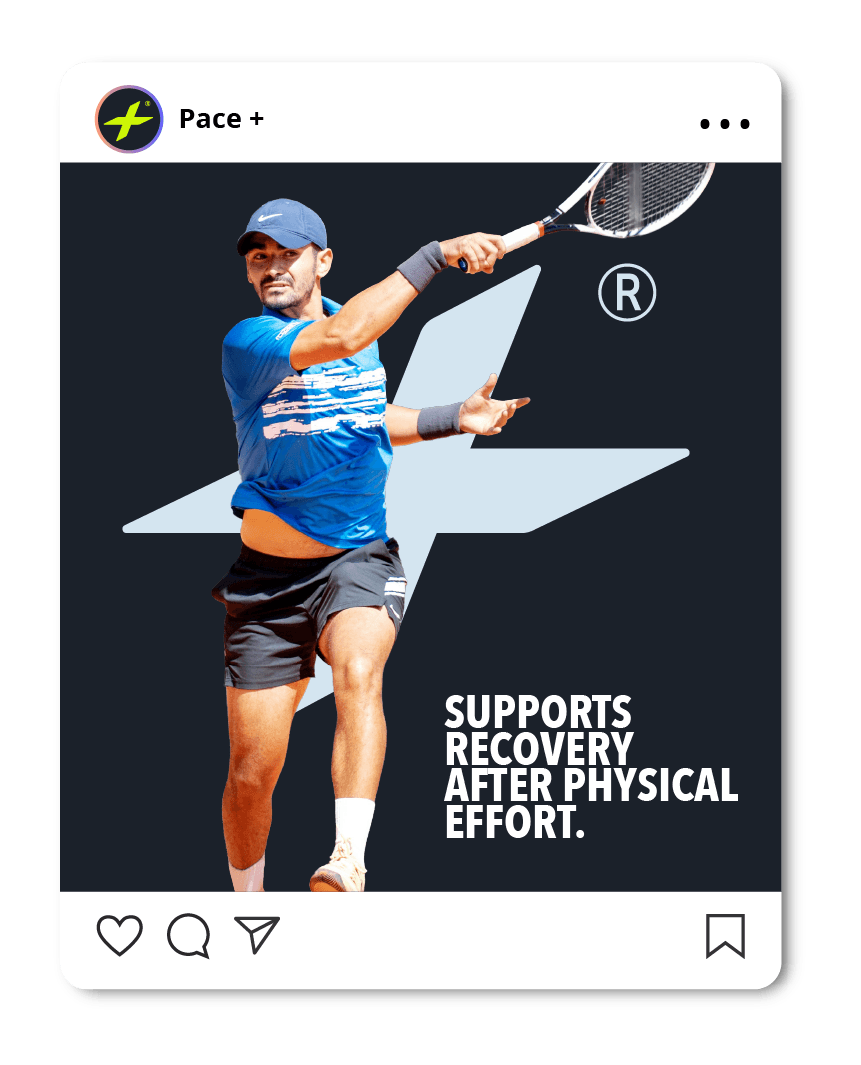
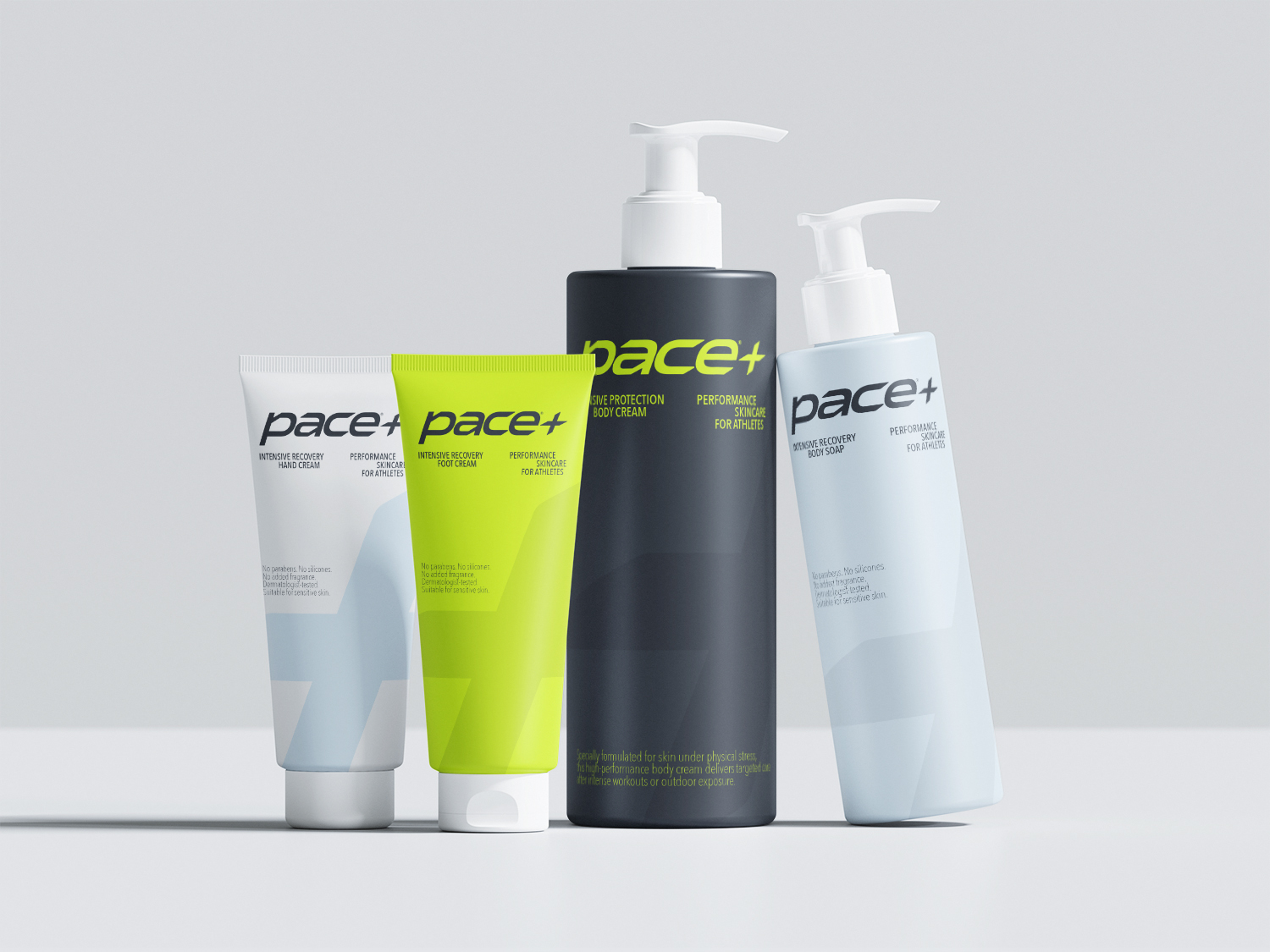
The artistic direction is anchored by the “+” symbol, used as a recurring visual element. It acts as both an iconic marker and a compositional tool, structuring layouts and guiding the placement of imagery across applications.
This visual identity seeks to establish a deliberate balance between energy and intensity on one side, and softness and recovery on the other — reflecting the dual rhythm of effort and regeneration at the heart of the Pace experience.