
Design of a logo and a comprehensive visual identity system for Modiabiz.
Modiabiz supports international companies in shaping and executing their commercial strategy in Israel. From building strong brands to accelerating business growth, facilitating local market entry, forging strategic partnerships, and driving commercial expansion, Modiabiz offers a comprehensive range of services.
The visual identity needed to reflect this multifaceted expertise while meeting a specific requirement: incorporating a bee-shaped logo. This symbol lies at the origin of the company’s name and holds personal significance for its founder, whose name means “bee” in Hebrew. The bee embodies Modiabiz’s core promise — enhancing brand visibility, unlocking business opportunities, and supporting clients in both establishing and elevating their presence in the market.

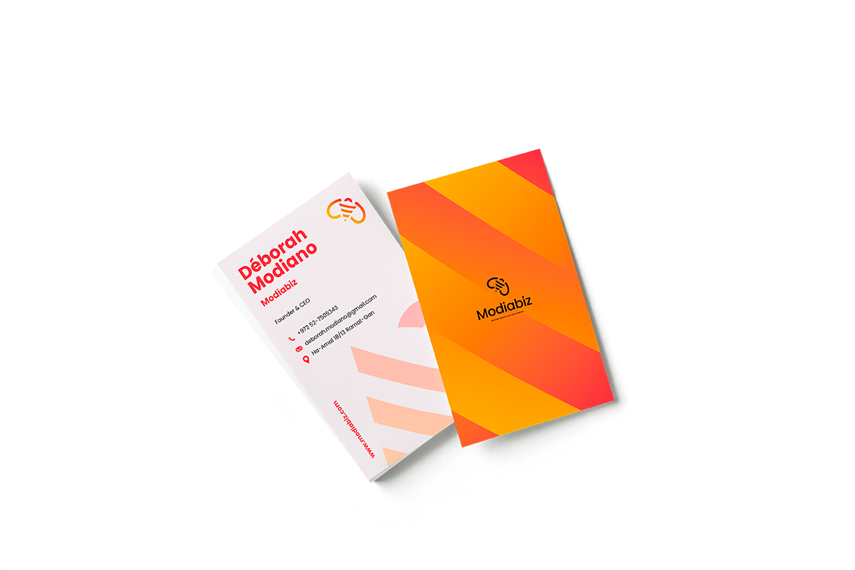
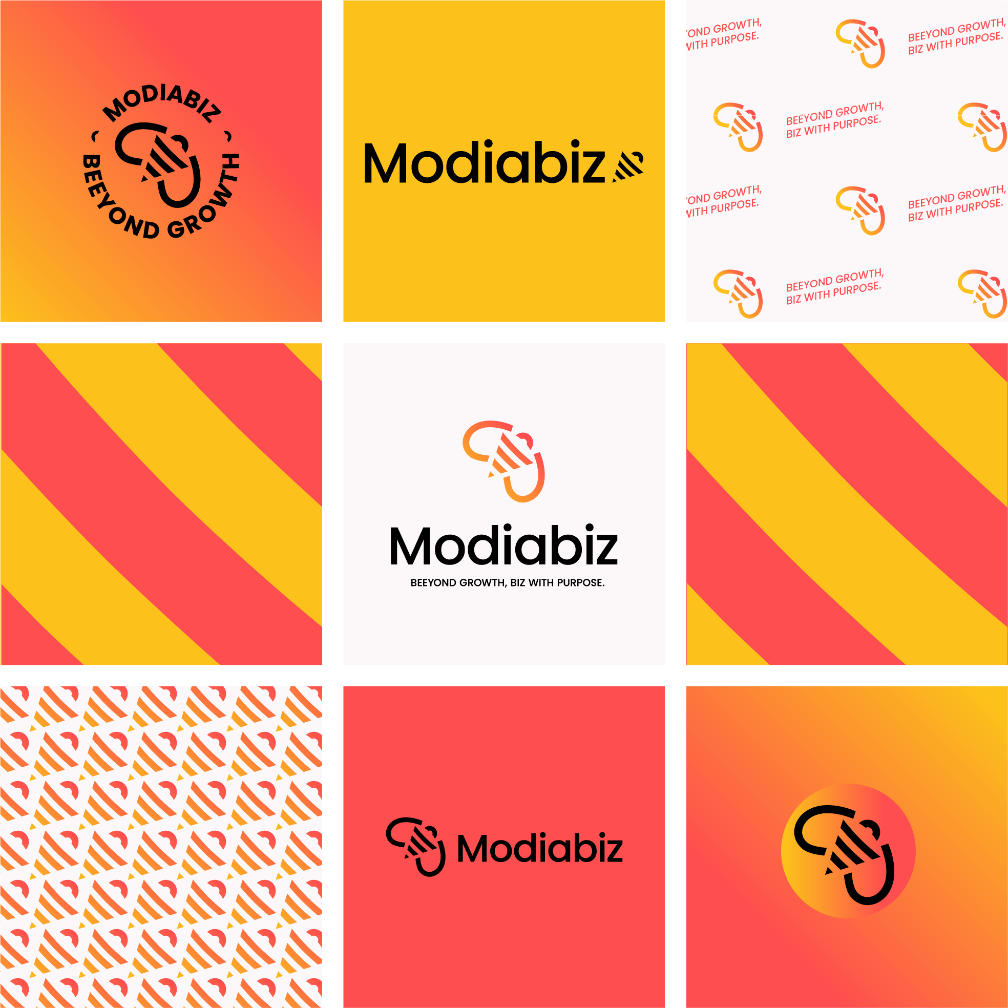
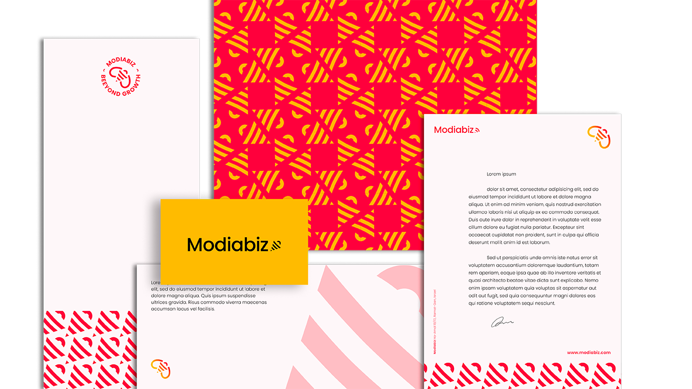
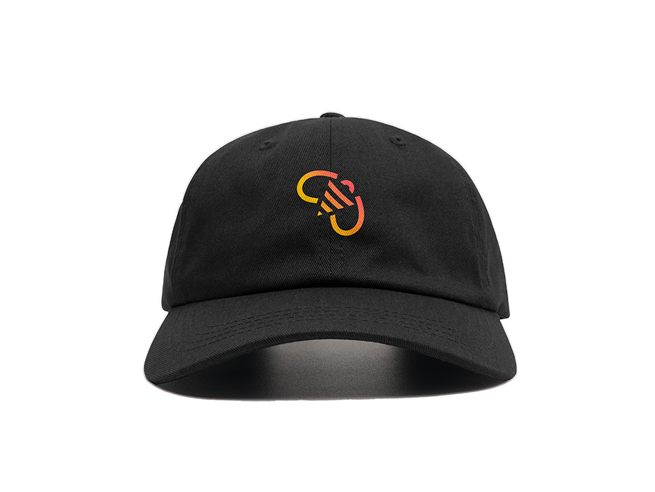
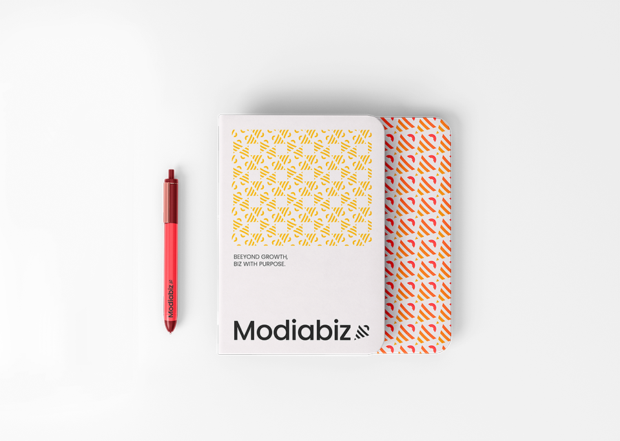
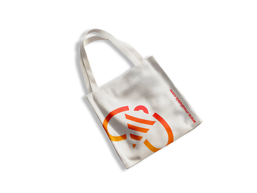
The supporting visual elements, inspired by the dynamics of a buzzing hive, express the energy and collective momentum Modiabiz brings to each project, fully aligned with the ambitions of its clients.
The color palette is bold and vibrant, reflecting the founder’s distinctive and radiant personality. The use of gradient color blocks introduces a sense of progression — almost like a loading process — that builds intensity over time, symbolizing growth and continuous activation.


Designing a coherent visual system that truly aligns with a company’s objectives requires more than aesthetics: it demands meaning. And capturing the essence of the founder within the visual intention is just as essential — especially for small and medium-sized businesses, where the brand is often a direct extension of its creator.


